
OverviewProblem
Research indicates that having more engaged and informed patients can improve health outcomes, lead to better patient care and lower costs.
Outcome
We were awarded 1st place for the functional Android native app we created to help individuals make informed decisions with regard to health insurance.
ProjectGoogle Health
a digital product that empowers our communities by improving accessibility to healthcare services.
InfoTeam
4 UX Designers, 2 Developers &
2 Data Scientists
UX Designer, Prototyper
24h
Timeline
Role
ResearchUnderstanding the problem
Given the timeframe, we prioritized data that would be quickest to analyze while also giving significant insights moving forward.
Our data scientists were able to establish a clear relationship between uninsured individuals and living under the poverty line, so we came to the consensus that accessibility to health insurance had great potential for further exploration.

Key FindingsMajor insights and findings
Our data scientists kept digging, initializing a thorough predictive model for insurance plans.
After combing everything through, three main insights were revealed.
1
Incomplete information
When choosing a health insurance plan, people make decisions based on insufficient information.
2
Unclear details
Information on health insurance plans are relayed in a confusing and inconsistent manner.
3
Challenging process
Even after choosing a plan, finding in-network services & availability for patients can be difficult.

OpportunityHow might we improve community health insurance access to ensure patients find network services in their budget?
Proto-personaUnderstanding our user
Now it was time to think about who we were designing for.
Drawing from the data, our user was likely an uninsured individual living in Texas. He just wants a simple way to take in insurance options to see what they can afford.

User StoriesExplaining our user’s perspective
Next we needed to develop an understanding of what content was important. We opted to write user stories because they explain in plain English what something does and how it adds value.
Keeping the Derek in mind, we decided on three key user stories to further develop.
1
“I want to be matched to the best insurance policy so that I don’t have to explore option.”
After easily entering their personal details in a click through questionnaire an appropriate insurance provider match will be generated.
2
“I want to easily see what all my options are so that I don’t miss out on a better choice.”
Having an exhaustive library gives people a resource to explore countless insurance providers, helping them make an informed decision.
3
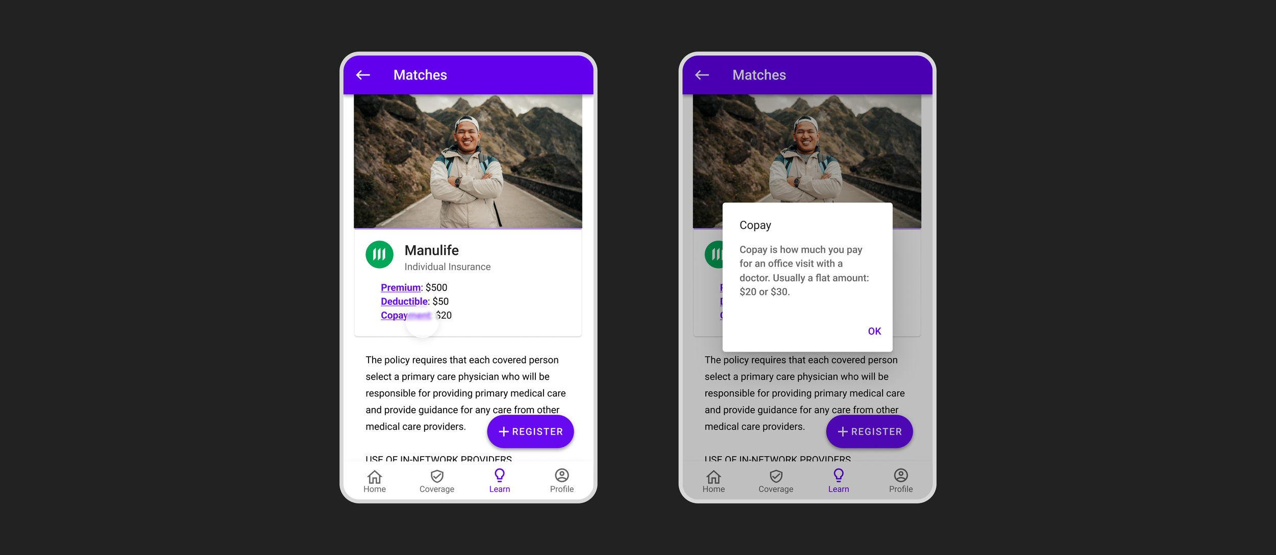
“I want to understand all the terminology so that I know what’s in each policy.”
Embedded throughout the app, anyone can click on confusing vocabulary to give a simple definition. This helps to make the app accessible to everyone.
SketchingBuilding out the experience
Looking at our user stories, I took on the responsibility to draw up both the low and mid-fidelity wireframes before transitioning to the computer to help with efficiency.
I focused on three core features.

1
Insurance matching
The first screen is for user onboarding while the second screen displays your best matches.
2
Ability to explore options
This screen details all of the relevant information to each insurance policy in an easily digestible format.
3
Terminology glossary
Complicated words specific to insurance plans will be underlined an the user will be able to click on it to get a definition.
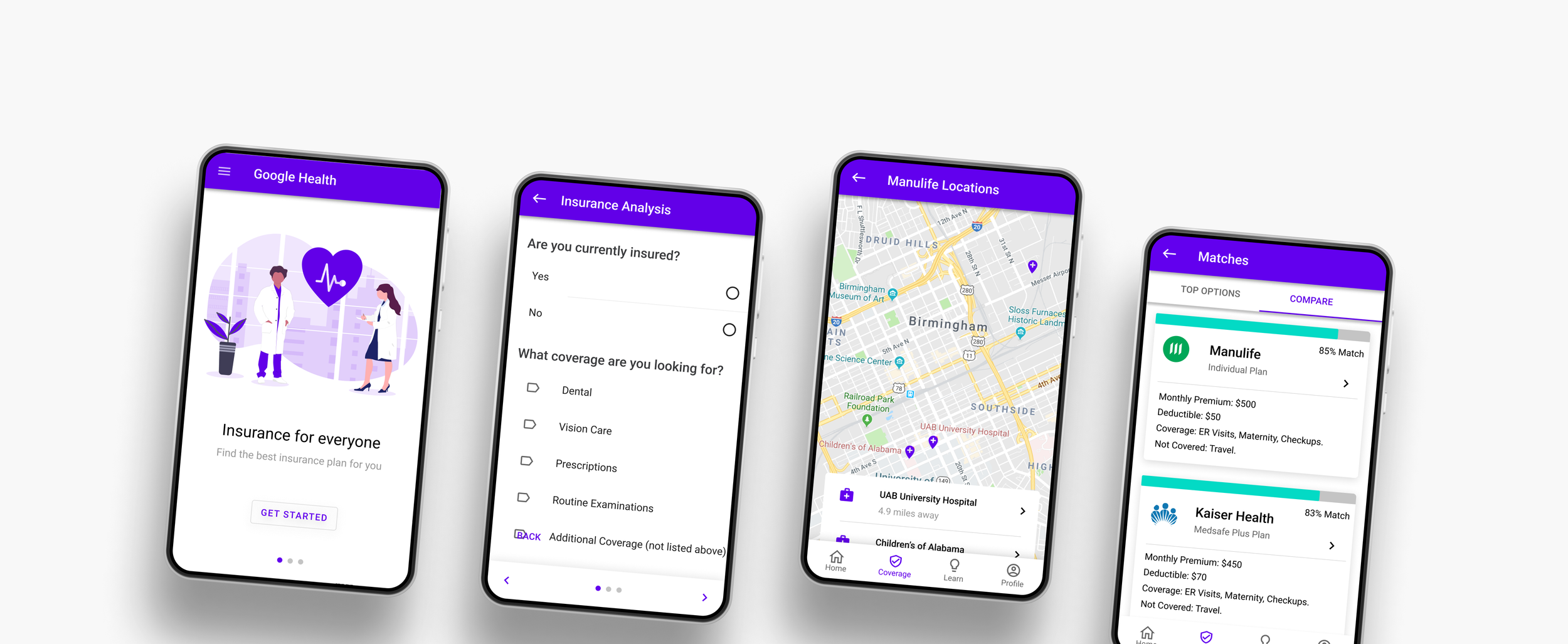
Solution 1Find your best insurance match
Users can quickly and easily enter their information to be smart matched with the optimal insurance provider.

Solution 2Explore all options
Compare policies to one another and see which nearby locations have coverage.

Solution 3Learn as you go
Quickly understand words you many not be familiar with so you can make an informed decision that’s right for you.
RetrospectiveFinal thoughts & takeaways
1
Push the comfort zone
Initially it was overwhelming designing an app that would help people access health insurance considering I lived in Canada and I am accustomed to free insurance.
But there’s no time to learn like the present! This project challenged me to do thorough research and push myself more than I thought possible.
2
Communication is key
What kind of data were you able to find? What do you think of this design? How many hours will you need to build this? Do you need any help with the presentation deck?
Things that made sense to me weren’t necessarily clear to others on the team, and vice versa. By talking openly and frequently we were able to avoid major hiccups and stay on track.
3
More is more..?
When we first started I didn’t have a clear idea realistic expectations from the other disciplines. How long do data scientists need to build a predictive model? How long will developers need to build out the designs?
Working together not only added value, but ultimately built a superior solution as a whole.