OverviewProblem
With only 30 recipes right now, we need more! How do we make this faster while maintaining quality?
Outcome
We created a digital product that streamlines and automates the recipe creation process, allowing new recipes to be generated with the click of a button.
ClientHelloFresh
a digital solution that improves the recipe generation process by verifying ingredients adhere to parameters.
InfoUX/UI Designer, Prototyper
6 UX Designers
Timeline
24h
Team
Role
Client BriefUnderstanding the problem space
HelloFresh sells the most popular meal kit in the world. They are on a mission to change the way people eat forever.
HelloFresh prides themselves on providing a diverse set of recipes, ensuring a positive customer experience. However, the recipe creation process is done using several different systems, which can cause delays.
✅ What is working?
Recipe creators are able to find and have access to all of the information they require.
❌ What is not working?
Recipe creators have to use multiple tools to gather all of the recipe specs together.
💫 What could be enhanced?
Recipe creators spend too much time looking up technical details when creating new recipes.

OpportunityHow might we help recipe developers create more recipes without hiring in any new resources?
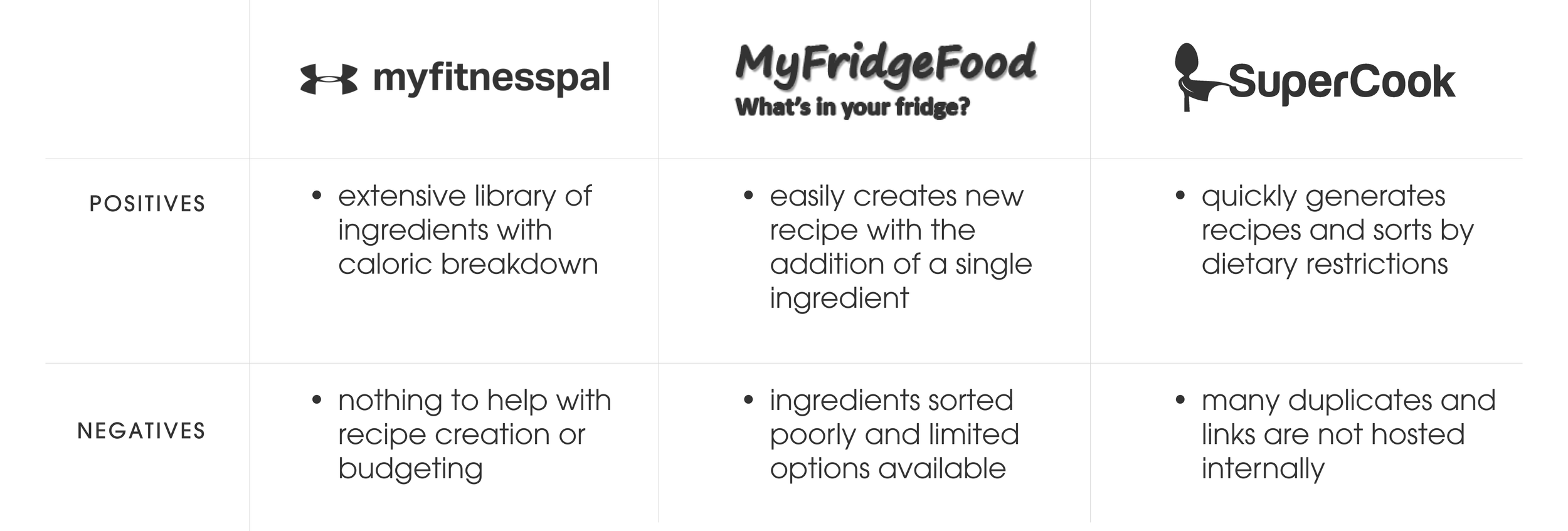
Competitive AnalysisLooking for opportunities
Now it was time to conduct competitor analysis. This was important because it allowed us to see what already existed in the space and find our gap in the market.
IdeationSketching ideas
Taking the information we had recieved into account I decided that a recipe calculator would greatly benefit our recipe creators.
Solution 1Automatically determine acceptance criteria
Instantly see if recipes are meeting parameters and know what to change if it is not.
Solution 2Change ingredients to your hearts content
Automatically update recipe specs as new ingredients are added or subtracted, including categories such as calories, price per serving and number of ingredients.
RetrospectiveFinal thoughts & takeaways
1
Pivot
Initially, we started in a different direction. While in theory it could have worked, it lacked originality and creativity.
Suffice to say because we weren’t tied to ideas we were able to come up with a significantly stronger and more impactful final deliverable.
2
Desktop ≠ Mobile
There’s a lot of space to play with on desktop.
This pushed me outside of my typical mobile-first approach and allowed me to gain a new appreciation for responsive designs.
3
Out with the old
I wasn’t proud of the original design so I took it as an opportunity to give it a makeover. It’s amazing how putting in a bit of extra time can make such a meaningful difference.

Nice right?
We should chat about it.


