ProjectSkinCertify
a digital product that empowers consumers by validating the claims and promises found on skincare products.
InfoUX Designer
Academic
Timeline
10 weeks
Type
Role
OverviewProblem
In 2020, the Cosmetic Skincare Industry estimated at $145.3 Billion. With the market so large, consumers have an overwhelming number of factors to consider when shopping for new skincare products.
Outcome
I created a product that helps save shoppers countless hours and gives peace of mind when purchasing a new skincare products.
MethodOrganizing the process
In order to organize my process, I followed the Double Diamond Design Methodology. This promotes convergent and divergent thinking, allowing ideas to be widely explored before focused action. It consists of four stages, which establish and guide the creative process.
ResearchUnderstanding the problem at hand
1
Secondary research
Gathering news articles, peer-reviewed studies and online blogs helped find existing qualitative & quantitative information about skincare label literacy.
2
Competitive analysis
Looking to competitors allowed me to understand different ways some of the problems were being addressed and how I could offer an improved solution.
3
Interviews
Conducting 1-on-1 interviews to gained qualitative insights into the problem. This taught me to about existing behaviours when it comes to evaluating skincare products.
Key findingsMajor insights and findings
1
Buying skincare is complicated
Skincare ingredient lists are lengthy, full of baffling scientific jargon and people don’t understand what’s actually inside.
2
Product labels are confusing
People feel like key words and claims are baseless. They don’t explain about what’s actually inside the products.
3
The process is overwhelming
There are thousands of skincare products available on the market. It’s too hard to find the relevant information.

OpportunityHow might we better communicate information about skincare products to reduce confusion and boost confidence when making a selection?
Task selectionLocking down the solution
Following our key insights, our users need a quick way to check if a product is worth purchasing. Based on market research this is a novel idea, giving me a huge opportunity to create something unique.
Based off the task flow, four features need to be developed.
1
2
Home
Scan
A landing page that showcases products and makes it easy to get product info.
The ability to quickly and easily scan the labels of various skincare products.
3
4
Product
Onboarding
A way to personalize the experience and build trust.
A screen that displays product details and claims.
User testingEvaluating and iterating on the experience
Now it was time to testing things out. Overall testers were able to complete all of the assigned tasks, but there were a few stumbling points.
The big take away was that testers loved the idea & design but had hard time navigating the app. Based on this feedback I made three changes.
1
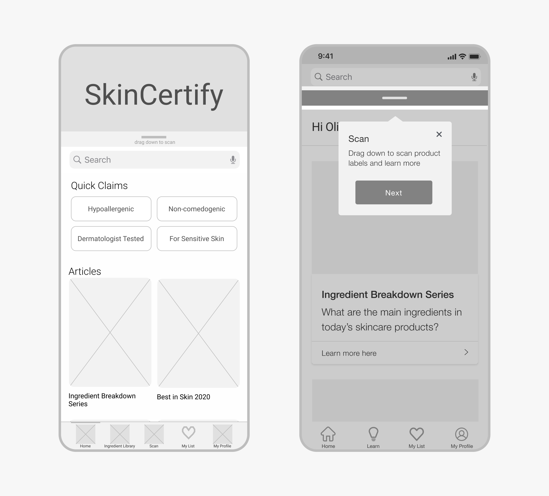
The key scan feature was difficult to find.
I increased the contrast and added a tooltip so that the feature was harder to miss.
2
What does ‘Quick claims’ mean?
Switching to ‘Recommended for you’ alleviates the confusion and makes it easy to find verified products.
3
Initially the product page was overwhelming.
This violated the heuristic principle of Aesthetic & Minimalist Design, so I moved the ‘Claims, Ingredients & Reviews’ to a new page.
Solution 1Easily access information
Users can quickly and easily scan products to learn more information instantly.
Solution 2Validate claims & promises
No more guess work. Claims are analyzed using AI to see if there is any scientific evidence to support them.
Solution 3Delightful onboarding
Since users find the entire process of buying new skincare overwhelming, the sign up experience needed to be easy and personalized.
Sign-up
Easy login and sign-up using existing social media accounts.
Onboarding quiz
Quiz gives personalized product recommendations, helping to reduce the guess work.
RetrospectiveFinal thoughts & takeaways
1
Design for others
I came into this guns a blazing, solution in hand and raring to go. I knew exactly what I was going to design.
But would my users actually want to use this? Keeping a user-centered focus during the process kept me honest and allowed me to design the best solution.
2
Interview questions matter
In hindsight I tailored my questions in the direction of answers I expected to hear. How many more insights would I have revealed if I had been more open minded?
Spending more time listening and less time guiding the conversation is critical to the solution.
3
More is more
“I like it that way” is not an appropriate defense when articulating your design decisions.
Sharing my work allowed me to view it through the lens of others. As a result, I was able to build a strong design rationale.
Pretty impressive right?
We should chat about it.
*This was an academic project and SkinCerify is a fictional brand


